Monday, December 30, 2013

Reflecting Glass Chicken

Reflecting Glass Chicken/ oil on board/ 4 x4/ $75
Cleaning up after a busy family-filled holiday. In addition to ongoing large projects, here is a small warm up still life. This time, I used a blue cloth and a little glass chicken with the reflective brush washer.


http://www.dailypaintworks.com/fineart/sue-churchgrant/reflecting-glass-chicken/189670

I also had my painting "Apple Swirls" accepted into the Women Painters of the Southeast Third Annual Juried Members Exhibition and Sale opening in March 2014. I will post a larger image closer to the opening.

Saturday, December 28, 2013

Christmas Reflections

Christmas Reflections/ oil on board/ 4 x 4/ SOLD
A small study done as a warm up before working on a large commission. I loved the red reflections of the Christmas cloth napkin on the brush washer.
Hope your Christmas was great....only a little more company and then painting full-time can resume.


Friday, December 20, 2013

Thoughtful Santa

Thoughtful Santa/ oil on canvas board/ 6 x 8/ SOLD
Not many more days until Santa has visited and returned to the North Pole. I may have one more that needs to be painted. Today, I worked out painting a background loosely using rectified turpentine. Perhaps, I will be able to show you how that works out soon. I also painted and wiped a jar that just wouldn't work three times. Tomorrow will be better, no doubt!!

Thursday, December 19, 2013

Christmas Magic

Christmas Magic/ oil on canvas board/ 6 x 8/ $125
This little painting is a change from Santas but continuing in the season's theme.

Artist Note:  I love painting the bright red color and the orange, yellow and purple to give red its form. Recently, I have switched from cadmium yellows and orange to Holbein permanent yellows and orange. The red remains cad red light and alizarin crimson.

http://www.dailypaintworks.com/fineart/sue-churchgrant/christmas-magic/187845

Tuesday, December 17, 2013

Let's see what the elf has reported....

oil on canvas board. 6 x 8/ SOLD
This is the third Santa painting. I wonder what you think about the "elf on the shelf". I feel like Santa has gotten so aged that he has had to recruit a not-so-nice tattletale.....
I love using Santa to learn to paint. His beard and mustache cover a lot of the face and make it a little easier. That said, today I again wiped one before I got the next one to work.

Monday, December 16, 2013

Sylvan Duck

Sylvan Duck/ watercolor/ 6 x 5 1/2/ $75


Another little watercolor of a duck from Sylvan Heights. I often find adding some drips or spots onto the watercolor adds interest.
I also worked on a still life setup: something small with a trial of rectified turpentine in the background. I'll post it tomorrow. The background was very interesting and artistic using this turp. It made the surface a little tacky. Unfortunately, I painted over the background completely losing that interesting effect..but there is always tomorrow!

http://www.dailypaintworks.com/fineart/sue-churchgrant/sylvan-heights-duck/187304

Sunday, December 15, 2013

Ho Ho #2

Another Santa to work on my small figure series. Love the blue in this background!

Busy cleaning for company!!!


SOLD

Saturday, December 14, 2013

Little Red Duck Watercolor

Little Red Duck/ watercolor/ 6 x 6/ SOLD
Before I start painting the large painting I am working on each day, I start with a small exercise to warm up. Sometimes, the "exercise" takes way too long. However, I always learn from each one . Usually, the little paintings are painted onto a piece of the back of a large painting that didn't work. This habit seems to provide the "magic" because these little gems usually just work out.
This is one of these small paintings. It is another duck from Sylvan heights. I love these colors. Sometime, I will look up what the duck species is and where it is from.

Artist Note: The form is made possible by the warm yellows against the cool cerulean/cobalt blues.


Ho, Ho, Ho

I am working on goals for 2014. I think one of them will be to continue these little studies of impressionistic people. One of my heros, Karin Jurick painted 100 criminals to learn to paint faces in her unique style. Carolyn Anderson didn't tell us how many paintings she painted to learn to paint. Instead, she remarked that "she had done this for so long...." as she masterfully corrected our messed up lips, eyes, legs etc during class. I think 100 studies sounds like a target for 2014. However, I will have to ask people to send me well-lit photo references to get enough material to do this. I would especially like to paint well-lit children for this exercise. These would not be commissioned portraits. For example, the reference Santa of this painting would not find any part of him recognizable in this painting. I even changed the color of his glasses....
Now that he is photographed, I will return to him and fix his nose and the color of his right cheek.
Otherwise, I like him pretty well.
Looking for more Santas to paint!!


In case you are interested, this is the start of this Santa painting


Below is the image that is for sale. I took down the highlight on his nose. Here is the link:
http://www.dailypaintworks.com/fineart/sue-churchgrant/ho-ho-1/187151


Thursday, December 12, 2013

Still Life Study #3

This painting followed 2 wipes. However, the wipes were drawing problems. My color and strokes are improving. I am working on "painterly" paint application.
Probably this is too fresh to post because I think it is improving...
Will recheck tomorrow.

Wednesday, December 11, 2013

Child Study #2

I loved the knobby knees on this little guy. I wanted to paint the bright sun-bleached skin on a cloudy winter day.


Artist Note: This is painted with individual brushstrokes paying attention to the edges, especially the ones that are lost. I am practicing what Carolyn Anderson taught in her wonderful workshop.

http://www.dailypaintworks.com/fineart/sue-churchgrant/child-study-2/186458


Monday, December 9, 2013

Child Study #1

Child Study #1/ oil on canvas board/ 6 x 8/ $125

I have two directions in my oil painting presently. The first is still life which prompts me to paint directly, work with color mixing, follow light and learn to paint more "painterly" as Qiang would say.
The second is to learn to see photographs as paintings: to interpret the edges and use brush marks to paint paintings not reproduce the photographic image. Both of these exercises, I hope, will allow me to grow as an artist. Today, I am sharing a painting from a photograph I took.

Artist Note:  I like this painting's looseness. I like the lost edges, especially those produced by different colors side by side that are the same value.

http://www.dailypaintworks.com/fineart/sue-churchgrant/child-study-1/186045

Friday, December 6, 2013

Beagle Study

Beagle Study/ oil on board/ 4 x4/ $75

This is a small (4 x 4) painting that I did as a demonstration while at Hilton Head earlier this week.
I painted it on a primed black background. I had to wait until it dried to touch up the left eye.

Today, was a struggle. Two wipers and then finally something worth keeping. I'll post tomorrow!

http://www.dailypaintworks.com/fineart/sue-churchgrant/beagle-study/185515

Thursday, December 5, 2013

Study #2

Continuing on small still life paintings, after working on completing commission and entries.

Wednesday, December 4, 2013

Update

Home late yesterday from hanging work at Lowcountry Gallery in Hilton Head.
The space is great and the paintings look fantastic.
Here are images of some of my paintings in place.


Opening this weekend is the 6 x6 show in California. Be sure to visit the link and look at all the paintings.

Back to painting now....

Sunday, December 1, 2013

Study #1: Reds

Study #1: Reds/ oil on canvas/ 6 x 8/ $75
While I have not been posting, I have been painting. Large, complicated, slow paintings and small quick studies of still life objects.
For daily painting exercise, I will work on a small still life setup for the next month. I will put the ones I like on DailyPaintworks and continue to learn from others. Let's see what a month of directed effort can do.

http://www.dailypaintworks.com/fineart/sue-churchgrant/study-1-reds/184350

Wednesday, November 27, 2013

Commission #3

I have posted this painting without correcting the lighting and "living with it" for a little while. I think what I especially like about this painting is the color of the skin color against the blue background.

Artist Note: The skin has a lot of burnt sienna (orange) which is the compliment of the grey-blue background and the skin is warm, against the cool background.

I now feel that this painting is "done"  (as learning artists, we wonder how to know when a painting is done. The best answer I have heard is "when there is nothing else you can add") So I am posting this again, with good lighting, "done"  in the series of commissions.  There are some commissions that are secrets for Christmas so I can't post them (yet).

Happy Thanks giving!!

Tuesday, November 26, 2013

Commission Work 2

Here is a (link) to all of the 6 x 6 paintings that were juried into the Randy Higbee 6 x 6 show in California. If you can't go to the show, these paintings can be purchased on line. A word of caution, there are many absolutely beautiful paintings in this show, so click on the link when you have some time to enjoy them.

Here is another of the small commissions that I have recently completed. Can you tell by the posture of the child that this is the first day of school?
Great idea for a painting, isn't it?
It was  really fun to try and capture the "feeling" (milestone, anticipation, some anxiety? of the parent and child) with the movement of the background paint marks.

Monday, November 25, 2013

Commission Work 1

Darling Ballerina/ oil on board/ 5 x 7/ HAS A HOME
I have been working on completing a series of commissions. I hope to share many of them in the next several posts.
Commissions for me, take much longer than even my paintings that I am working on for show entries.
Commissions continue to be a learning exercise. First, I have learned to accept work only from someone who wants a painting in the style and of the subjects that I like to paint. (if you follow my blog, you know that I don't paint houses or detailed architectural structures). Next, I have learned that there are some requests that I can't accept. This may be because I am given an image  that I don't feel I can paint well enough to make the client happy. Sometimes, there is a deadline that I can't meet.
In fact, the commissions that result in my best paintings are usually given to me with absolutely no time pressure. That was the case with this ballerina painting. I was asked to paint from a beautiful photograph. This request was months ago but without a time deadline. I had enrolled in Carolyn Anderson's workshop. I felt that I would want to paint this after I had learned from this very special class.
Months later, the class completed, I love this little painting and give it with joy to its new home.

Saturday, November 23, 2013

November's Class

Please excuse the lighting and angles. These little paintings were completed today by our small Nov class. A remarkable preteen student keeps up with all of the adults. We worked on first paintings of glass and learning about transparent and opaque paints. We also painted on a new surface for many. After these little paintings, everyone worked from life.
As usual, I think I had the most fun.

Thursday, November 21, 2013

My Hat is Too Big

My Hat is Too Big/ 6 x 6/ watercolor on aquabord/ Low Country Gallery
This is another painting on aquabord

Artist Note:
The most notable thing about this painting is that it was painted on a board that had an unsuccessful painting on it that was completely washed off.

Until it is fixed, you can wash back to the white, soften edges, and easily alter colors.


Wednesday, November 20, 2013

Painting on Aquabord

Recently, I have been experimenting with watercolor on aquabord  by Ampersand (link).  Aquabord can be treated to frame work without glass. Aquabord  is a bright white clay coated hardboard that feels coarse both to touch and to brushes.

What I have learned so far: I have found that synthetic brushes work best for me on this surface. Advantages of this surface include the ability  to  use transparent application of thin layers of color which gives the sparkle and translucency that is special to watercolors. For me, this works best by prewetting the area for the thin wash, complete drying and then rewetting and reapplication of an additional thin wash. This surface uniquely allows for the correction of watercolors by washing back to the bright white base.  For granulating or deeper color, I find it is better to lay unmixed component colors in creamier consistency onto larger prewet or smaller dry areas of the painting. I especially like the way the surface allows the bleed backs that add interest to the paintings.

Here are some recent paintings on aquabord, I especially like.
Sentry/ watercolor on aquabord/ 6 x 6/ unframed/ Low Country Gallery


Monday, November 18, 2013

Miniature Grapes

Miniature Grapes/ watercolor/ 2 x 4/ Low Country Gallery
This is another miniature painting. If nothing else, painting this small works on brush control.
My goal was to capture the smooth reflective grapes against an opaque, dull surface.

Artist Note: Glassiness is attained with sharp edges and bright highlights.


Sunday, November 17, 2013

Sharp Shadows: Class Demo

Sharp Shadows/ oil on board/ 6 x 6/ Low Country Gallery
This coming Saturday (November 23) this will be the demo painting that we will do step-by-step for the first half of our class. With this style of teaching, the instructor paints a passage (a piece of the painting) and then the class paints the same passage. I think this type of teaching works really well if there is also teaching/reinforcement so the student can go home and practice with this new information on their own painting.

Artist Note: This was painted on black primed gessobord. On Saturday, we will experiment with different prime colors. This painting also uses the knowledge of the differences between transparent and opaque pigments. If you are local and might be interested in this class, we have at least one spot available this time.


Friday, November 15, 2013

Almost Finished

This is a requested painting by a family member. I am posting it tonight, almost finished, still attached to the waterbord that I use to stretch large paintings. I'd love to hear what you think.

I shot this with my phone so the focus and lighting are not great. Sometimes after a long day of painting, I am too tired to go set up to shoot the resulting painting correctly. Today was such a day.

Today, I also painted some things I hope to enter into upcoming competitions, so I will save them to share after the deadlines have passed (in or out).

Thursday, November 14, 2013

Christmas Pup


Christmas Dog/ oil on board/ 4 x 4/ Suttons Gallery
I haven't painted a dog for a little while and I came across this great image from last year. Since I am starting to make my lists......

Artist Note: This is painted on a black primed surface and I allowed small pieces of the black to show through which flattens and abstracts the image somewhat.


Wednesday, November 13, 2013

Watercolor Miniature

Funny Bird/ watercolor miniature/ 3 x 3/ SOLD

I thought it might be possible to paint smaller paintings faster to have things at a "gift" price point for the holidays. This little miniature is the second one I painted. The first is in the trash.
It is extremely difficult to paint this small scale . The time to paint this was at least twice the time to paint an oil painting that is four times its size. I guess this explains the price point when I look at miniatures in galleries either the on line or brick and mortar types.  However, there is definitely something very special about this little painting and I want to try another.


Tuesday, November 12, 2013

Still Life Study

I am working on painting from life and in this case, I get to eat the set up (though the orange slices do dry out under the lights). Tomorrow, I may add a glass or reflective surface to the set up.

Artist Note: This is Qiang Huang's (which is also Richard Schmid's) palette. The transparent darks (mostly transparent red oxide and ultramarine blue) make a good distant background and are incorporated into the shadow colors.

Sunday, November 10, 2013

Home again

This was photographed while still on my easel (hence the shadows on the top by the hands). It was painted on the fourth day of Carolyn Anderson's fantastic workshop that I attended a week ago. Carolyn filled the four days of class with fabulous demonstrations, hands on explanations and help while the class painted from models, and one half day from Carolyn's photographs. Carolyn also shared and explained her understanding about light and color, edges, color mixing and ideas about components of an exciting, interesting painting. Probably this was the best workshop that I have experienced. I hope to continue learning from it as I look over my notes, attempt to incorporate what she taught, and read the books Carolyn suggested. I also want to relook at works by Sargent, Serov, Fechin, Tkachev and others that she shared in class as she discussed color temperature and types of edges.


At the conclusion of the workshop, my wonderful husband picked me up. We traveled to see the exhibition of Sargent's watercolors at the Boston Museum of Fine Arts and celebrate our 29th wedding anniversary. On our way home, we stopped at Chad's Ford and saw work by another favorite painter, Andrew Wyeth. Now, with the cat continuing to complain about my prolonged absence (howling everytime she spots me) , three loads of laundry going, my notes transcribed and e mail answered, and I am starting to feel "home. Hope you have been painting. I can't wait to share what I have learned......

Thursday, November 7, 2013

October: A slower painting month

It is starting to feel like autumn here. However, it is still hard to fathom where October went...What a great month: lots of travel,  fantastic workshops both attended and instructed, a painting juried into another great show (web site will have details because my web mistress is busy updating as this is written ), and some lovely small paintings that I loved painting!!

Christmas is coming and I am starting to collect images to "get in the season". I have a wonderful dog in a Santa hat that I collected from 2012 and some commissions that will be gifts, so not publishable (yet).


Monday, November 4, 2013

Little Owl

Little Owl/watercolor/ 6 x 6/ SOLD

I love this little guy. He was tucked back into a corner of his cage with poor light and yet those green eyes were still visible watching visitors watching him...


Artist Note: I continue to work on birds, using them to practice the foreground being integrated into the background (see how the white in the shoulder becomes the white of the background).


Friday, November 1, 2013

Sunflowers: Learning and practicing

If you are a painter, or even if you love to look at paintings, please consider asking someone that loves you to give you Richard Schmid's newest book: Alla Prima II (link).
You will love the images of his paintings. I am trying to use his paintings to learn to paint flowers These brown-eyed Susans are a still poor copy of his but I will have many opportunities to retry them since I now own this beautiful book....

Wednesday, October 30, 2013

Chessmen will be in Wilson

Picture

The travel portion of the North Carolina Watercolor Society National Exhibition opens in Wilson at Barton College. on November 6th. 2013. A reception is scheduled for Saturday, November 9th 5 PM to 7PM in the Case Art Building, Art Gallery Building on the Barton Campus. I would love to see you there! This exhibition closes December 16,  2013.

Tuesday, October 29, 2013

Flamingo Study

Flamingo Study/ watercolor/  6 x 6/ Low Country Gallery
This is my series of birds continued.
My goal is to abstract more of the birds themselves (see how the back is the background?)

 Artist Note: The colors in this are scarlet red, yellow ochre, translucent orange, some cobalt violet and quin gold plus whatever was on my palette to make a black.


Monday, October 28, 2013

Calendar 2014


I put together some of my favorite images of 2013 for a calendar for 2014. If you are interested in having one, it is $23.95 while supplies last, with free shipping. A collage of the images follows.


Saturday, October 26, 2013

Oil Painting ONE

I've missed some posting days. It has not been because I have missed painting days. My painting days have been a little shorter lately and the paintings I am working on are larger and more complex.

This past week, my painting days were shorter because I gathered the materials necessary to teach this beginning oil painting workshop. Everyone had a private setup and an individual light. We learned beginning basics (palettes, mediums, brush types, cleaning...) and then after thinking about how to create and light a set up we began with value. After learning to see shapes and not objects, and decide whether things were "lighter or darker",  we explored the effect of cool or warm light sources on the same simple setup. There was a great amount of time where there was complete silence as everyone worked on their paintings. This group of students made remarkable progress. As the paintings were placed side by side, everyone had improved even over course of the day. In addition, everyone had successfully seen and painted the different temperatures of light.

For me, this was a great day. My hope is it was as fabulous for each class member as well.
We continue next month and may have some more intermediate painters join us.

Wednesday, October 23, 2013

Watercolor: the challenge of too much pigment poorly applied

Presently, I am painting a three large watercolor paintings. I thought it might be interesting to illustrate with this one what it means to have  a watercolor be "overpainted" or "dull"or "dead" in color. These ladies are sitting on a stone bench. I chose granulating, sedimentary colors and applied them as a large mix onto prewet paper. After it dried, I knew that the colors I chose would work, but this painting will be recycled into the back of smaller paintings in the future. I lost the "white" of the paper


Here is the painting started over again. The same colors have been used but they are not premixed. Instead they are dropped onto prewet paper individually and floated to mix. This will be repeated once more to adjust the value after more of the painting is completed. I can only add one more layer of these colors though, or I will return to the lifeless thick wall above.


Artist note: The colors used included yellow ochre, cerulean blue, sepia, permanent rose and rose madder. The darker browns had some ultramarine dropped in as well.

Tuesday, October 22, 2013

Windy Cosmos

Windy Cosmos/ oil on canvas on board/ 7 x 13/ Low Country Gallery
A second "flying flower" painting. I had a great time playing with the texture on this one and experimenting with ways to make the flowers "dance" and "move".

Monday, October 21, 2013

Rose Study 1

Rose Study 1/ oil on board/ 4 x 4/ Suttons Gallery
Lit from the left, on a dark cloth, here is my rose after Qiang's workshop.

Artist Note: The background was transparent red oxide and ultramarine blue.  The green leaves used cad yellow green plus cad yellow and/or thalo or ultramaring blue. The rose was cad red light, alizarin crimson, cad yellow light, white plus some background grey mixed in for shadow areas. This is tiny so getting district brushstrokes without smearing is still a challenge.


Sunday, October 20, 2013

Notes from Qiang Huang Workshop: part 2

Qiang Huang Workshop Notes cont'd
Stage 3: COLOR!!
Maybe, for me, the most important thing I learned in this workshop was that clean intense color is kept to a small part of the painting. Anyone who watches me paint knows that I love and misuse color (too much, too many places). That said, limiting a small area of color allows it to "pop" because of the beautiful supporting greyed color.
Qiang paints from dark to light. In the color stage he said that he asks himself ""where is it warm...cool...?"(in the value stage, he asks "where are the darks and lights"). He first added the shadow areas of the orange gourd. His greyed the shadow area by mixing cad orange with ultramarine blue but then warmed it with some cad red. This was placed in thoughtful, careful strokes that defined the shadow forms. He remarked that to lighten a color without cooling it, he adds cad yellow. He then placed the highlights on the pot to be able to compare between dark and light. Next, he painted the grapes which he made by mixing thalo blue with some of the background greys. These were painted with a bristle brush in small defined strokes. He painted the reds in the grapes with a mixture of alizarin and cad red light plus some white to cool this.
The copper pot was painted with transparent red oxide plus an existing grey for the top. The highlight was made with cad yellow deep and white (?plus cad red light). Highlights are painted with a bristle brush to add texture. The base of the gourd has a line of alia crimson plus premixed dark grey which anchors the gourd. Some patches of color have color shifts painted in smaller strokes or areas between strokes.


Color Stage: Blocked in (not modelled)


The color stage slips easily into

Stage 4: Modelling
This stage takes the most time and makes some of the patchy color forms believable (some are left as impressionistic forms). In this stage, he uses more edges (soft, lost and hard). He models one shape at a time.

Stage 5: Consolidation
This stage considers the totality of the painting. Perhaps a linear element needs to be added here (a twig, wire, ribbon). Together there needs to be a clear center of interest and abstract elements.

Day 2
Qiang reinforced these painting stages by having each of us paint each stage after watching him demo the same stage using his own set up.

Day 3
Qiang gave an informative talk about his business experience especially using the internet.
He then completed his painting from the previous day, picking up at the consolidation stage. He started by adding a rose to this painting.  Qiang reminded us that flowers need CLEAN, PURE color. Therefore, he wanted to paint on a clean background. Because the paint was dry, it didn't scrape well. Instead, he needed to wipe a small area with gamsol soaked paper towel. He described the rose he was painting as a cylinder. He illustrated where the highlight, shadow and midvalue areas would exist on a cylinder (and therefore on the rose). He mixed alizarin, cad red and white. He also mixed some perm rose with white. He used a synthetic brush to form sharp thin edges because roses have sharp edges. To create the shadow color, he added some background grey to alizarin (ultramarine plus transparent red). He stroked in small shapes of small changes in value. To the lighter areas he used strokes of cad red plus white (the rose  is lightest on the outside). The top, he painted straight white. He then painted in small shadow lines using a tiny brush. He added abstract shapes of greens for leaves and some other abstract rose shapes. The stems were added for movement and design.

Qiang's painting with the rose added


Saturday, October 19, 2013

Workshop with Qiang Huang: My Notes: part 1

After a great learning experience, like the past 3 days with Qiang Huang (link), I usually transcribe my notes. In addition, I promised my friend and wonderful hostess Maria Hock Bennett (link) that I would take notes for her for the day that she missed. However, usually, months later, when I need to refer to these same notes, let's just say that I have issues with my filing system. Therefore, I decided to post my notes here, share them with you and be able to find them whenever.

First, if you have the opportunity to take a class with Qiang (pronounced "Chong"( like Cheece and..)), it will be worth whatever you need to do. Qiang is extremely well organized and has worked to breakdown his painting process into "teachable" stages. There is nothing better than to watch him paint these stages and then listen as he goes easel to easel and teaches from each person's struggles.

Day 1
Qiang describes the well planned agenda for the three day workshop.
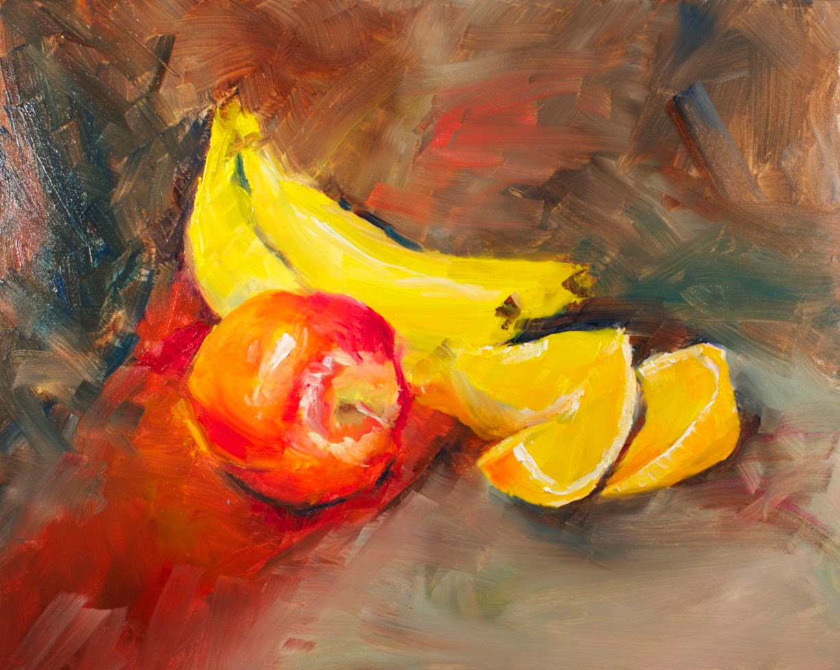
On this first day, he describes how to create and light a setup. He likes his setups to be close to eye level. He suggests that the subject matter is not about what you are painting but about how the objects manipulate light. He chooses objects carefully: large and small, manmade and organic: complimentary colors to create vibrancy and tension: a light, midvalue and light object, a rough and a smooth textured object. Because we read left to right, he arranges the light shining from the left and creating interesting shadows falling to the right. Qiang also illustrated the effect of a blue gel placed over lights (He uses blue gels (that he sells) over lights that shine on his palette and his canvas to get a north cool light effect). Gels can also be used over the light shining on the setup to increase cool or warm effects.

When he starts painting, he shares a tip that a tiny amount of gamsol on either canvas or gesso board helps with the initial paint block in.

Now he starts to paint beginning at Stage 1: Placement
In this stage he decides where the objects will be placed and their sizes. He defines the table line and considers the proportions.

Stage 2 which flows from Stage 1 is a value study using transparent colors to make a dark, light and midvalue grey. He used synthetic brushes for this stage and used transparent red oxide and ultramarine blue for this painting. In this exercise, the background is the darkest value and he paints it with a large brush with carefully placed strokes. Later he remarks that even these strokes are placed to lead the eye toward the center of interest. He leaves the lights mostly untouched and paints in the midvalue greys. To recover lights, if needed, he either scrapes them off using a shaper or wipes them clean with a small piece of paper towel soaked in gambol.


He then mixes an opaque grey using cad orange and ultramarine blue with some naples light yellow and strokes this using bristle brushes into the area around the objects where there are mid value greats. This starts another dimension: transparent and opaques (thin or thick) passages of paint. He remarks that opacity adds a solidness. He puts touches of this grey onto the mid values of the objects.


(this photo shows the camera he uses to allow everyone in the class to see)
Tomorrow, Stage 3 is Color.
If you are impatient and want to see Qiang's finished painting click here

Glad to be home.